
The “Digital Flyswatter Effect
You’ve seen the “best practices” articles. They told you that popups are the #1 way to grow your email list and save a sale. So, you installed a high-energy plugin that triggers a 15% discount offer the moment a user moves their mouse toward the “back” button. You even added a “Spin to Win” wheel for good measure. But instead of a flood of new subscribers, your analytics show a different story: The Immediate Close. In the world of E-commerce Leaks, “Popup Rage” is a user experience disaster. This is the Interruption Friction. The pain here is The Concentration Break. Imagine walking into a physical store, and before you’ve even seen a single product, a salesperson jumps in front of your face and screams, “DO YOU WANT A COUPON?!” You would turn around and walk out.
When a popup appears too early, covers the entire mobile screen, or has a “Close” button so small it requires a sniper’s precision to hit, the customer doesn’t feel “offered a deal”—they feel attacked. This creates Negative Brand Association. If your popup has a 98% “Close” rate and your site bounce rate increased by 10% after installing it, you aren’t “capturing” leads; you are annoying your best prospects into leaving. You’re trading a $50 potential sale for a $0.05 email address that will probably mark you as spam anyway.
The Solution: From “Intrusion” to “Value-Add”
To fix popup rage, you must move from “Hard Interruption” to “Behavioral Synchronicity.” You need to offer the right thing at the exact moment the user actually needs a nudge.
| The Friction | The Fix |
| The “Too Soon” Pop | Implement Scroll-Depth Triggers. Only show the offer after the user has engaged with at least 50% of your content. |
| Mobile Hijacking | Use Slide-ins or Banners. On mobile, a full-screen popup is a Google SEO penalty and a UX nightmare. Use a small “Bottom-Bar” instead. |
| The “X” Hunt | Make the “Close” Button Obvious. If they want to say no, let them. Forcing them to hunt for the exit only increases their anger. |
| Irrelevant Offers | Use Page-Level Targeting. If they are looking at “Blue Shoes,” show them a “Blue Shoe Guide,” not a general 10% off everything. |
The “Gentle Exit” Strategy: Instead of a giant box, use a “Tab” that follows the user. It stays tucked away until they click it. This respects their autonomy while keeping the offer visible. If they do go to leave, use a “Micro-Question” instead of a discount: “Didn’t find what you were looking for? Tell us what’s missing.” This gathers data even if you don’t get the sale.
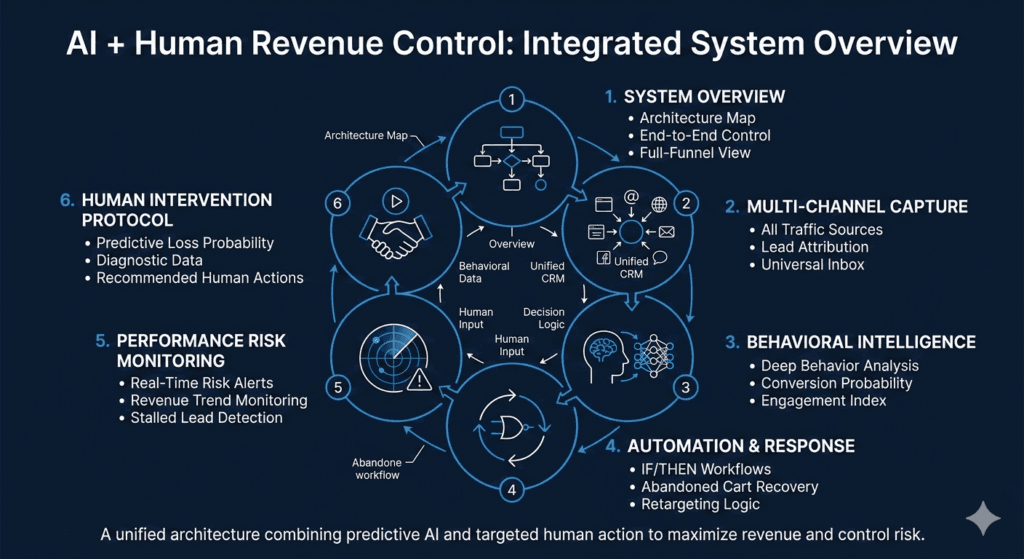
🤖 + 👤 Human-AI Partnership
Our strategy utilizes AI Predictive Engagement Scoring to determine the “Sweet Spot” for every individual visitor. The AI tracks mouse velocity and dwell time to predict exactly when a user is “bored” versus “ready to buy.” While the AI manages the Dynamic Triggering and A/B Testing, our Human Strategists focus on the “Non-Intrusive Copy.” We write the headlines that make the popup feel like a helpful suggestion rather than a digital roadblock. We use AI for the timing and Human manners for the relationship.
What is the most annoying popup you’ve encountered lately?
Was it the ‘Spin the Wheel’ or the one that didn’t have a close button? Let’s vent about ‘Popup Rage’ in the comments!
That concludes the “Tier 1: Problem-Solver” series! Ready to move into “Tier 2: The High-Level Pillar Posts”? Starting with Topic #21: SaaS Retention Blueprint.
Ai+Human Partnership Funnel specialist
Get your 14 day free Funnel trail
Or
Book an Audit .
crvservice.com
Store
Whatsapp +1 346-306-7727